Data Visualization using Apache Zeppelin
In our final tutorial using the CASAS dataset, we demonstrate the flexibility of Zeppelin with it's ease of visualization.
Setup
We start off by downloading binary Zeppelin package with bundled with all of its interpreters from an Apache mirror. The file is 1.5GB, so patience is required. After the download is complete, you can untar and start Zeppelin.
tar zxvf zeppelin-0.9.0-preview2-bin-all.tgz
cd zeppelin-0.9.0-preview2-bin-all/
bin/zeppelin-daemon.sh start
In order for PySpark to use the GridDB JDBC driver, it must be added to the CLASSPATH. Todo this, click on the menu in the top right corner, then interpreters. From that page, scroll down to "Spark" and click "edit". Then scroll down to Dependencies and add an Artifact which is the path to your gridstore-jdbc.jar. If you've followed the JDBC Blog, it will be /usr/share/java/gridstore-jdbc.jar.
Single Sensor
To start off with, we're going plot a single temperature sensor. It's a fairly straight forward query, the only complexity being that we need to convert the message column to an integer as it's stored as a string in GridDB.
%spark.pyspark

from pyspark.sql import functions as F
from pyspark.sql.types import *

df = spark.read.format("jdbc").option("url", "jdbc:gs://239.0.0.1:41999/defaultCluster/public").option("user", "admin").option("password", "admin").option("driver", "com.toshiba.mwcloud.gs.sql.Driver").option("dbtable", "csh101_T101").load()
The data is loaded one long call that specifies the JDBC URL, username, password, driver, and container (aka, "dbtable").
df = df.withColumn("temp", df["message"].cast(IntegerType())).drop("sensor").drop("translate01").drop("translate02").drop("message").drop("sensorActivity")The above code adds a new column temp which is based on casting the "message" column to an IntegerType and then we drop the remaining columns except for dt as they are not required for the visualization.
z.show(df)
Finally, we use Zeppelin's visualization function, z.show() to plot a graph. To plot the graphs properly, we needed to drag and drop the temp field into the values as shown below: 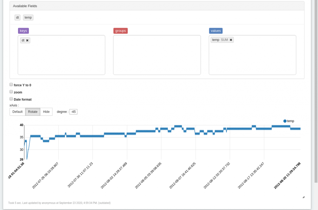
Multiple Sensors
%spark.pyspark

from pyspark.sql import functions as F
from pyspark.sql.types import *
from functools import reduce
from pyspark.sql import DataFrame

tdf = spark.read.format("jdbc").option("url", "jdbc:gs://239.0.0.1:41999/defaultCluster/public").option("user", "admin").option("password", "admin").option("driver", "com.toshiba.mwcloud.gs.sql.Driver").option("query", "select * from \"#tables\"" ).load()

tdf = tdf.filter(F.col("TABLE_NAME").startswith("csh101_T"))
In this example we query a table using .option("query",) instead of a loading an entire table and then filter the results so we are only fetching tables that begin with "csh101_T" or all of the temperature sensors at the Casas 101 site.
df_names = []
dfs = []
for f in tdf.rdd.collect():
    table = f["TABLE_NAME"]
    df_names.append(table)
    rawdf = spark.read.format("jdbc").option("url", "jdbc:gs://239.0.0.1:41999/defaultCluster/public").option("user", "admin").option("password", "admin").option("driver", "com.toshiba.mwcloud.gs.sql.Driver").option("dbtable", table).load()
    dfs.append(rawdf.withColumn("temp", rawdf["message"].cast(IntegerType())).drop("translate01").drop("translate02").drop("message").drop("sensorActivity"))

outdf = reduce(DataFrame.unionAll, dfs)

z.show(outdf.orderBy(outdf.dt.asc()))
With a list of the temperature sensor names, we query the individual sensor containers/tables before merging them and using the Zeppelin display function to show them. Now within the Zepplin visualization tool, we drag and drop sensor to the Group list box and temp to the Values list box as seen below: 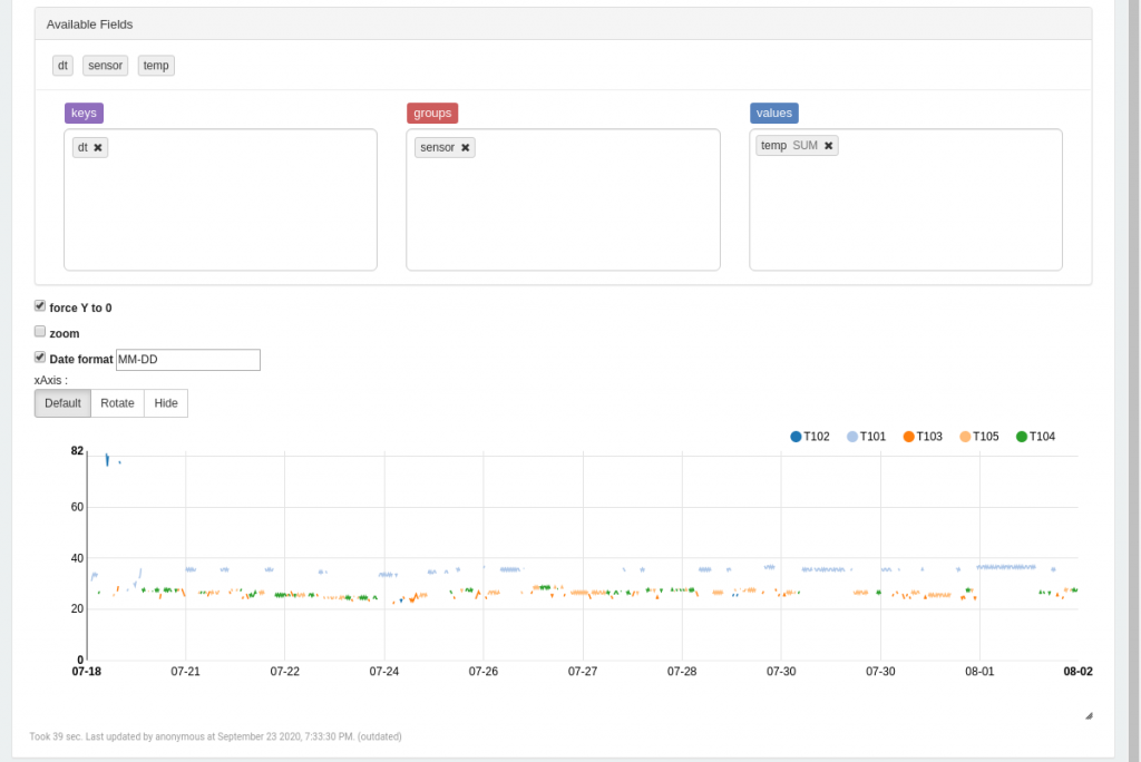 The Zeppelin notebook can be downloaded here.